
For the last 50 years, meteorologists have analyzed weather maps of upper air conditions using constant pressure surfaces. These charts are prepared for several mandatory pressure levels twice daily (0000Z and 1200Z) from the temperature, humidity and wind data provided by the operational radiosonde network, supplemented with data from aircraft reports and satellite-derived wind data in data sparse regions.
Upper air charts are constructed for mandatory pressure levels in the atmosphere: 850 millibars (about 5,000 feet), 700 millibars (about 10,000 feet), 500 millibars (about 18,000 feet), 300 millibars (about 30,000 feet) and 300 millibars (about 30,000 feet).

Meteorologists use these constant pressure charts rather than constant altitude charts for several reasons. Since most aircraft of the time used pressure altimeters, most “constant altitude” flights were actually flown on constant pressure surfaces. Furthermore, the radiosonde data (from which the charts are prepared) are reported in terms of pressure. Finally, use of pressure as the vertical coordinate simplifies many of the thermodynamic equations and computations.
Upper Level Pressure Charts
Upper air charts will be analyzed at three separate levels of the atmosphere – one in the lower troposphere at an altitude of approximately 5000 ft (1.5 km), a second in the mid troposphere at approximately 18,000 ft (5.5 km) and the third in the upper troposphere, near the tropopause, at approximately 30,000 ft (10km). Each level furnishes a slightly different perspective of the atmosphere; hence, the meteorologist looks for certain features in each.
The atmospheric variables typically plotted on these isobaric maps include:
- The height of the pressure surface
- The air temperature
- The wind speed and direction
- When applicable, the dewpoint, an indicator of atmospheric humidity.
Essentially all these charts can be produced with analyses that include height contours (lines connecting all points on the surface having the same altitude) and isotherms (lines of each temperature). Some charts, primarily the 300 mb chart, may have “isotachs”, which are lines of equal wind speed. An optional background discussion of the salient features of an isobaric chart appears below.
The 850 MB Chart
The 850 mb chart, representing weather conditions in the lower troposphere, is at a level that is above approximately 15 percent of the atmosphere in terms of mass. At an altitude of approximately 1500 meters (5000 feet), this level is above most of the influences of surface friction in the many sections of the country. Unfortunately, the 850 mb intersects and goes below the terrain in the Rocky Mountains. For example, the “Mile High City” of Denver, CO usually has a surface pressure – a measured value not corrected to sea level – of approximately 830 mb, which places it at a higher altitude than the 850 mb surface.

Meteorologists often look at the analyzed temperature field of this level, because over the non-mountainous regions, the diurnal temperature cycle is much less than at the surface. They can frequently tell correctly that precipitation falling in regions with an 850 mb temperature of 0 degrees Celsius will probably fall as snow, while rain would more than likely fall at warmer temperatures.
The 500 MB Chart
The 500 mb chart represents weather conditions in the mid- troposphere, at a level where approximately half the mass of the atmosphere lies below this level. This level is at an altitude of approximately 5,500 meters (18.000 ft). This level is often used to represent upper level flow conditions because the level is well above the effects of topography and friction and the level is below the region in the upper troposphere where the air flow may experience strong accelerations and decelerations when in the vicinity of the upper jet streams. Since many weather systems tend to follow the wind flow at this level, this level is often considered to symbolize the steering level of these systems.

The 300 MB Chart
The 300 mb chart is in the vicinity of the tropopause, at the top of the troposphere. Only 30 percent of the mass of the atmosphere lies above this level. The altitude of the 300 mb surface is near 9000 meters (30,000 ft) – at a level where many long-distance commercial jet aircraft fly. This level also corresponds the level of the upper tropospheric jet stream, a region of very fast winds that move across the country. Inspection of the isotach patterns at these levels not only reveal the location of the jet streams, but aid the meteorologist in locating the regions of largest acceleration, deceleration and wind shear (rapid changes in wind speed and/or direction); these regions contribute to the upper level horizontal divergence and convergence patterns that influence surface weather systems.

Features of the Isobaric Surfaces
The constant pressure charts differ slightly from the constant altitude charts, such as the surface analysis, which display weather information at the same geometric altitude. A constant pressure surface (or “isobaric surface”) can be visualized as a reasonably horizontal, but undulating, three- dimensional surface in the atmosphere, where all points on the surface have the same reported atmospheric pressure.
The altitude of the isobaric surface above sea level depends upon the density, and hence the temperature, of the intervening air column. In regions where the air in that column is cold and dense, the altitude of that isobaric surface will stand lower than over a region where the air is warmer and less dense. Since isobaric surfaces are three dimensional surfaces, “height contours” (or simply, “contours”) drawn upon an isobaric chart represent the topography of that pressure surface in identical fashion as isopleths of the same name drawn by cartographers upon topographic maps to depict the terrain.
Contours separate regions of high valued height for a given region from lower altitude regions. Because of the contour patterns, the higher altitude regions representing poleward intrusions of warm air, are identified as “ridges”. On Northern Hemisphere upper air charts, these ridges can be identified as regions where the height contours deviate far to the north. Strong ridges are usually associated with warm and dry surface weather. On the other hand, the lower altitude portions of the pressure surface are “height troughs”, or “troughs”, with equatorward intrusions of cold polar air. Troughs can be identified on a upper air chart as regions where height contours are deflected far to the south. Stormy weather and cold temperatures at the surface are often found under upper level troughs.
The isotherms and the resultant analyzed temperature field on many of the upper air charts often supports the above relationships. Typically, the best agreement occurs in the lower to mid troposphere. Some displacement of the isotherms away from the ridges and troughs may occur especially in the upper troposphere.On the upper tropospheric charts isotachs are often drawn to identify the jet stream. Typically, a region of winds are considered to be a part of the jet if the winds were at least 70 knots (where a knot is the unit used for upper air charts, which is equivalent to one nautical mile per hour). These regions as highlighted by the isotachs may be elongated and frequently found near the southern excursion of a trough.
Contour Intervals & Critical Values
It is very important to understand that the contour values which are listed here are not concrete. They are flexible from one event to another. Forecasters will often pick different beginning contour values to highlight parameters which they believe are critical although the contour intervals often stay the same
850 MILLIBAR MAP PLOT
Height – Begin with 156 with intervals of 30 meters, i.e. 153, 150, 147, 144…
Dew Point – Begin with the highest dew point with intervals of 2 degrees, i.e. 10, 8, 6…
Temperature- Begin with 25 and contour for every 5 degrees, i.e. 10, 15, 20, 25…
Height Change – Begin with + or – 6 with intervals of 2. Don’t contour values < +/-2

Critical Values
Height – Closed pressure centers ; frontal boundaries
Dew Point- Values in excess of +10
Wind – Low level jet, 30 knots or greater
Temperature- Large contrasts identifying frontal boundaries; narrow corridor of warm temperatures (+ 16 or greater ) near high dew point values.
Height Change- Values in excess of + or – 4
700 MILLIBAR MAP PLOT
Height – Begin with 312 with intervals of 30 meters, i.e. 309, 306, 303, 300, 297…
Dew Point- Begin with highest dew point with intervals of 2 degrees
Begin with dew point depression of 10 degrees with intervals of 5
Temperature- Begin with + 20 and contour for every 5 degrees, i.e., 15, 10, 5, 0, -5…
Height Change- Begin with + or – 6 with intervals of 2. Don’t contour values < +/-2

CRITICAL VALUES
Height- Closed pressure centers; ridge axis and trough axis
Dew Point- Values in excess of +4; dew point depression values greater than 20.
Temperature – Large contrasts to place fronts; temperatures of +10 or greater. Important: temperatures required to “cap” the atmosphere will vary according to season. Check the sounding to be sure you have a true “cap”.
Wind – Wind speeds at least 25 knots
Height Change- Values in excess of +/- 4; Look for rise/fall couplets
500 MILLIBAR MAP PLOT
Height- Begin with 576 with intervals of 60 meters, i.e. 570, 564, 558, 552… Temperature- Begin with -5 with intervals of 5 degrees, i.e. -10, -15, -20, -25… Height Change- Begin with +/- 6 with intervals of 2. Don’t contour values < +/- 2.

CRITICAL VALUES
Height- Closed pressure centers; ridge axes and trough axes
Temperature- Values of -15 or colder moving into an area of warmer air; 700 to 500 mb temperature changes in excess of 20 degrees; 850 to 500 mb changes in excess of 30 degrees
Height Change- Values in excess of +/-4; Look for areas where height rises border height falls to identify impulses and couplets.
Winds- Winds 50 knots or greater; jet streams/jet streaks; diffluent flow areas.
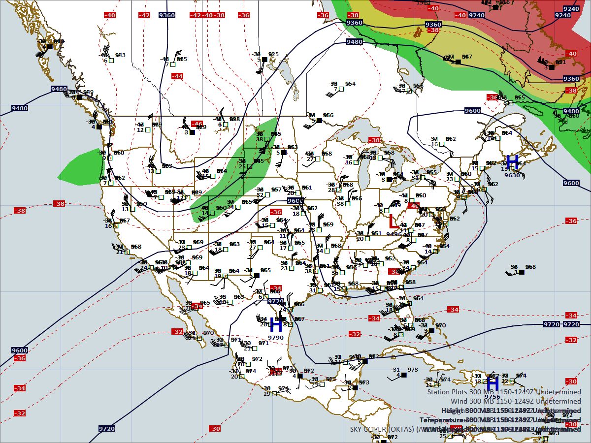
300 MILLIBAR MAP PLOT
Winds- Begin with the highest wind speed with intervals of 20 knots
CRITICAL VALUES
Winds- Speeds in excess of 60 knots and in excess of 100 knots; Identify left front and right rear quadrants of jet streaks.
Recent Posts
Determining Severe Weather Based On Stability Indexes and Upper-Level Winds
There are several weather products used to determine the possibility of severe weather for an area. The most common and misunderstood by many weather enthusiasts is the Skew-T chart and the upper-air...
Tornado Basics, Severe Weather Preparation, & The Enhanced Fujita scale
Earth's weather can produce various kinds of windstorms which include waterspouts, dust devils and tornadoes. Although they have the common features of a column of rotating air, they are actually...